
Save the save icon – Bewaar het opslaan icoon
|
|
| tupperware? |
|
|
| icon pur sang |


Voorstanders
van het behoud van het floppy-icoon hebben een argument als ze zeggen
dat het icoon zo wijdverbreid is dat het symbool lost staat van zijn
(legacy) oorsprong. Tegenstanders pleiten voor nieuwe symbolen die meer
met het vastleggen van informatie te maken hebben in plaats van het
opslagmedium. Een kleine inventarisatie:
- Vaak
wordt informatie bewaard in een mappen/bestandenstructuur. Een mapje
met bijvoorbeeld een groene inwaartse pijl is dan een optie. - Een
andere optie is om modernere opslagmedia af te beelden. De CD-r is
alweer passe, de dvd wellicht? Of een USB-stick? Maar ja, die zien er
zo verschillend uit.. - Opslaan wordt ook vaak voor de zekerheid gedaan. Een groen vinkje kan dan een optie zijn.
- Enkele
grapjassen
pleiten voor een Jesus-figuur (Jesus saves) of een Tupperware
bewaarbakje.
People who vote for the conservation of the floppy icon have a
legitimate argument when they say the save icon is so widespread that
the symbol looses connection with its legacy descent. Contras plead for
new symbols emerging more to the recording of data instead of a
particular recordable medium. A small inventory:
- Often information will be saved in / filed under a folder or document system. A folder with a green inward arrow is an option
- An
onther option is to visualize a more modern file medium. The CD
recordable is already historic, what about a DVD? Or a USB stick? On
the other hand, no USB stick looks the same.. - Saving is often a precaution. Just to be sure. A green check mark can be a suggestion
- Some jokers pleaded for a Jesus figure (Jesus saves) or a Tupperware storage
container.
|
|
|
|
|
|
| floppy based icons | textbased icons | check | folder | other |


Lees meer over het maken van favicons in .ico
Read more about creating favicons in .ico
 Veel (online) applicaties hebben als
doel om iets te maken, en vast te leggen voor later gebruik. Vanaf
begin jaren ’90 zijn de gebruikers-interfaces van computers steeds
grafischer geworden. Iconen vervingen de functie van tekstknoppen. In
1995 bijvoorbeeld gebruikt Microsoft’s Windows besturingssysteem de
floppydisk om de save-kop aan te duiden.
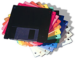
Er is een nieuwe generatie aan het
opstaan van mensen die niet meer weten wat een floppydisk is. (voor
jonge meelezertjes: http://nl.wikipedia.org/wiki/Diskette.) Het is dan
ook steeds moeilijker verdedigbaar dat het icoontje “save” op een
floppy lijkt.
Many (on line)applications have the purpose of creating something,
and save it for later. Since the early 1990’s computer interfaces
became more and more graphical. Icons replaced the need for text
buttons. In 1995 e.g. Microsofts Windows operating system used the
floppy disk to visualise the option to save your creation.
A new generation is coming of people who don’t known what a floppy disk is. (for the youngsters amongst us: http://en.wikipedia.org/wiki/Floppy_disk)
It will be more and more difficult to persist in keep saying the save
icon has to look like a floppy.